Moon Claws is a gel nail polish brand. This concept developed to exude mystery and celestial elegance. I designed the logo, brand identity, and product packaging with a dark yet whimsical theme. The branding communicates confidence and creativity through custom typography and hand-drawn elements.
Tools: Illustrator, Photoshop, Procreate
Role: Brand Designer
Highlights: Packaging designed to visually mimic phases of the moon, reinforcing the brand name and story.
Role: Brand Designer
Highlights: Packaging designed to visually mimic phases of the moon, reinforcing the brand name and story.

Gel nail polish brand concept: Moon Claws. Different logo layout sketches digitally drawn on Procreate using iPad Pro.

Exploring Adobe typefaces that will match the brand. Got feedback from my professor and a fellow classmate for which style to focus on.
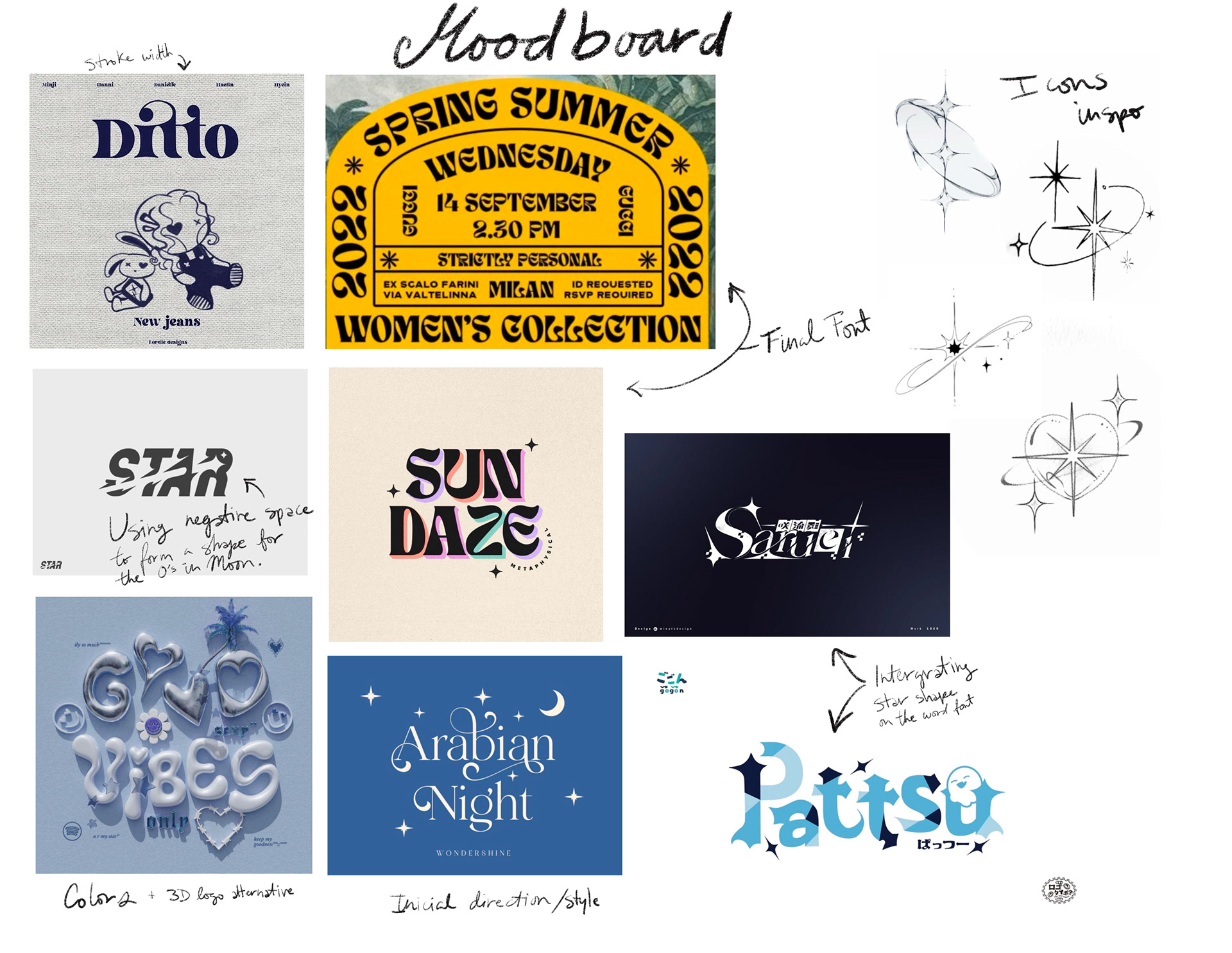
Moodboard elements in choosing font style, colors and icons. I searched on pinterest ‘star logo’, newjeans, 3D blue typography and galaxy stars to pull inspiration from. I found the final font I wanted to use and customized the end letters to include a star shape. Also adding a shape in negative space to the O’s in Moon.
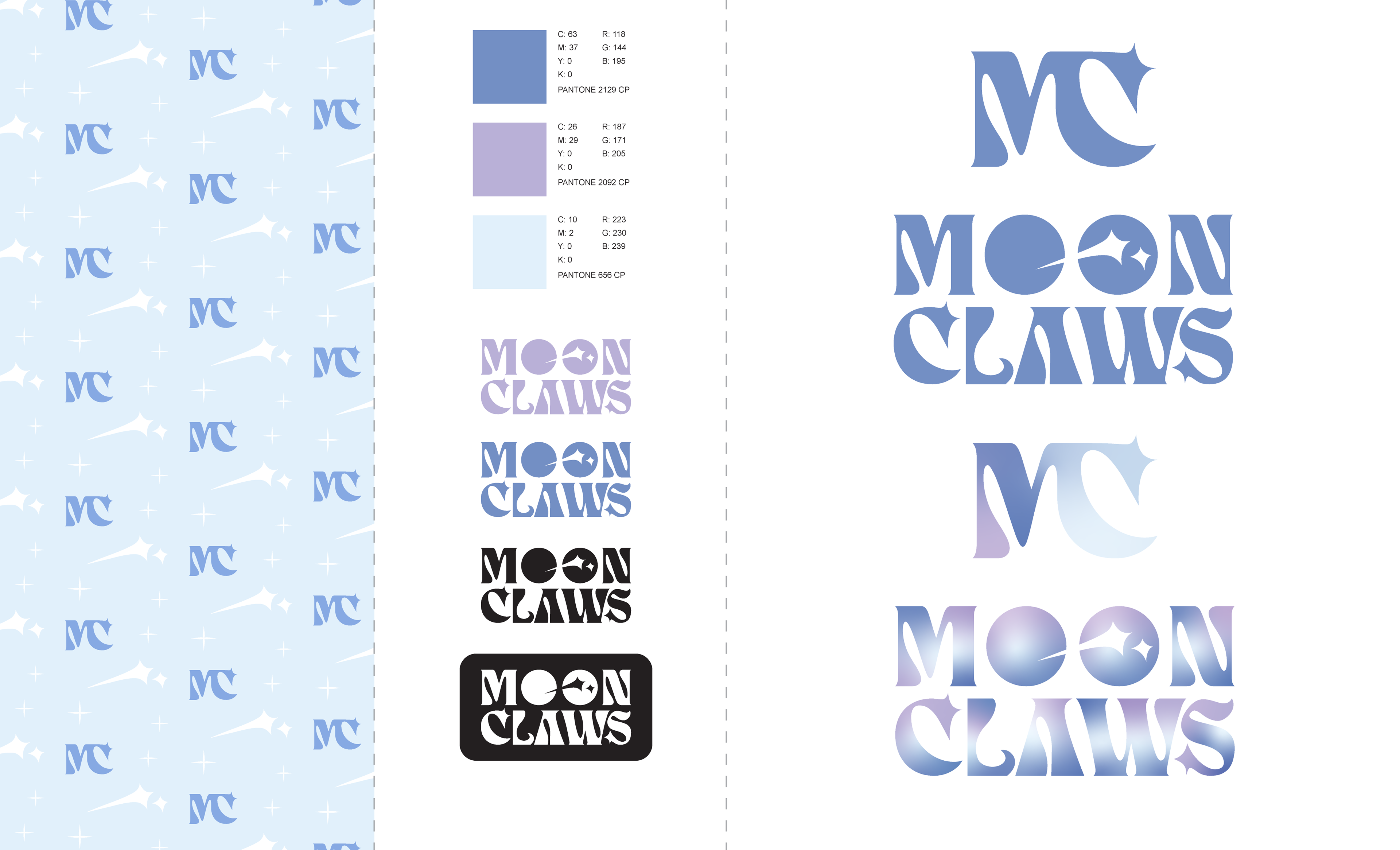
Final assets approved by professor: Logo, icon, pattern and colors. Vectors done using Adobe Illustrator.
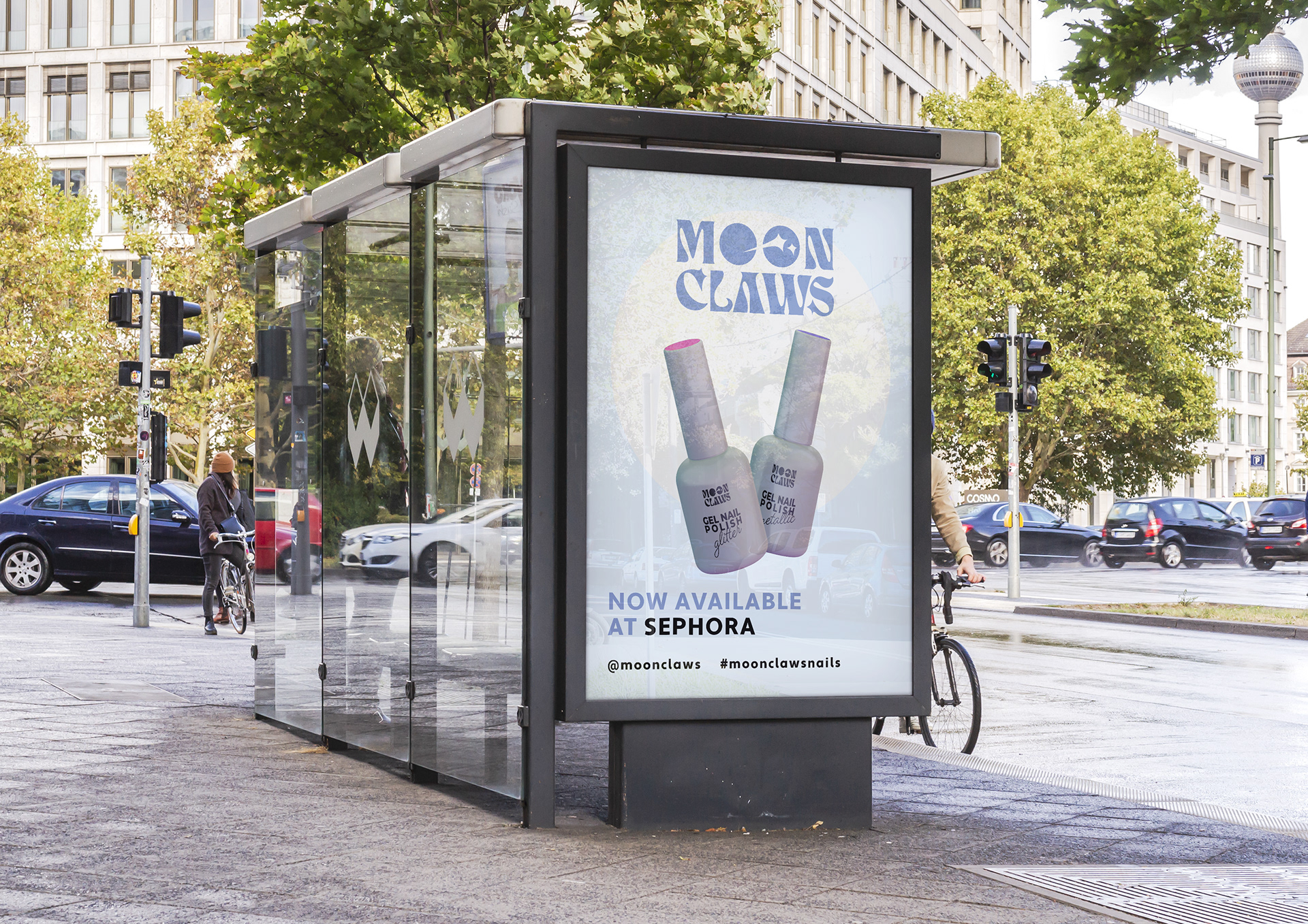
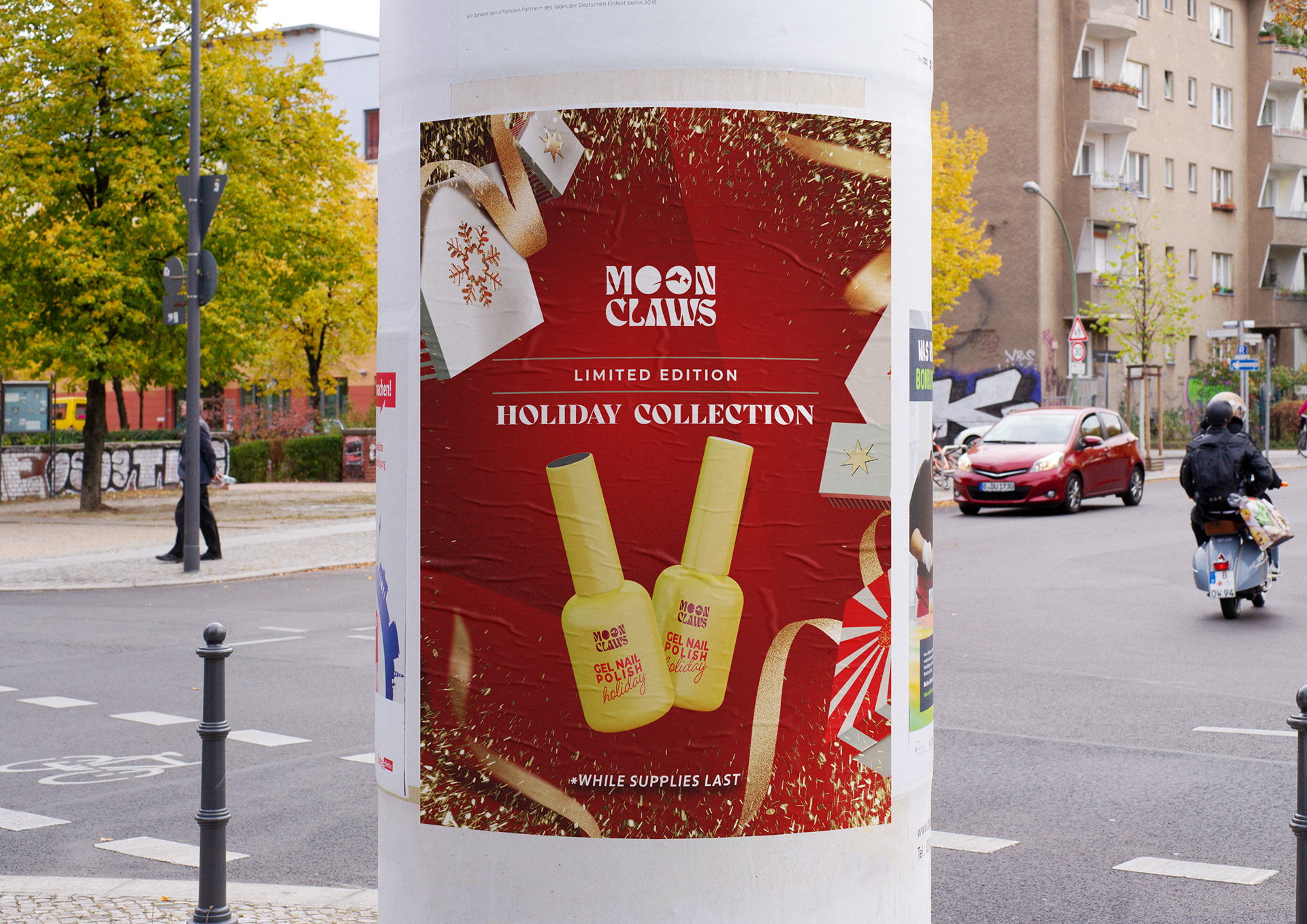
OOH Mockup Ads. Left side is promoting Sephora availability and the right side is a holiday collection limited edition nail colors.
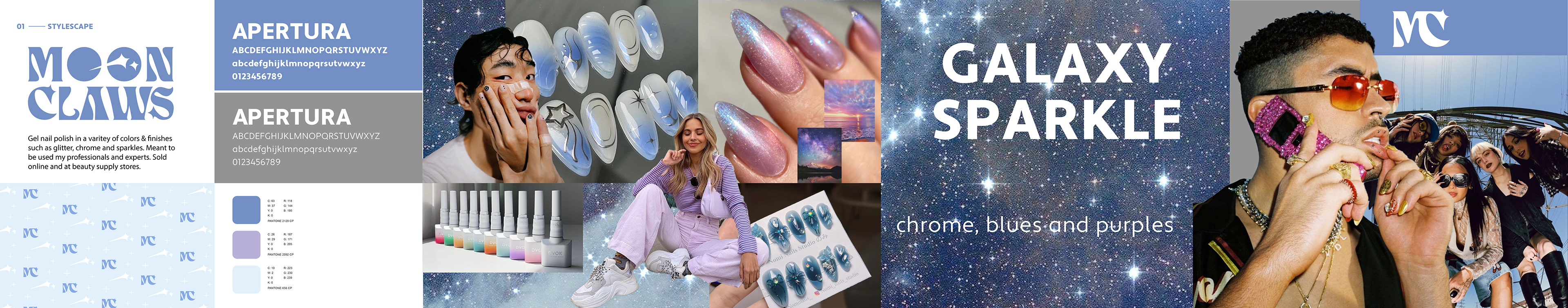
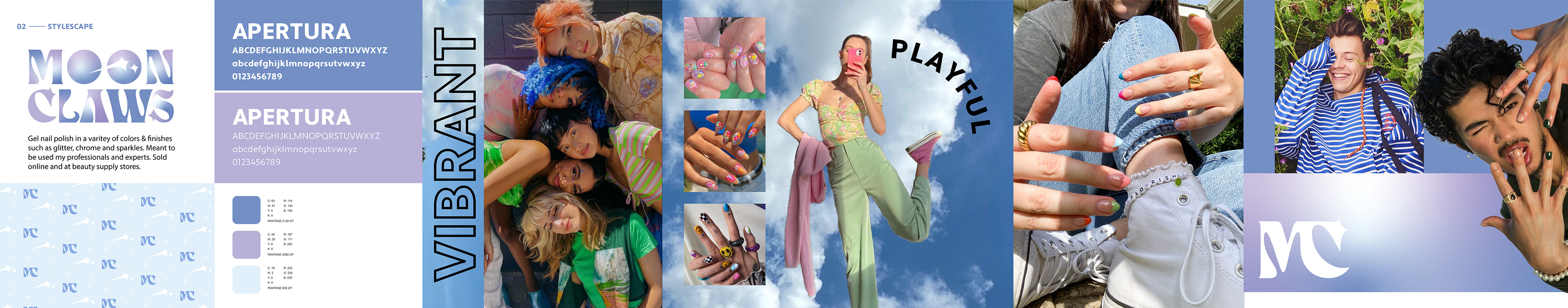
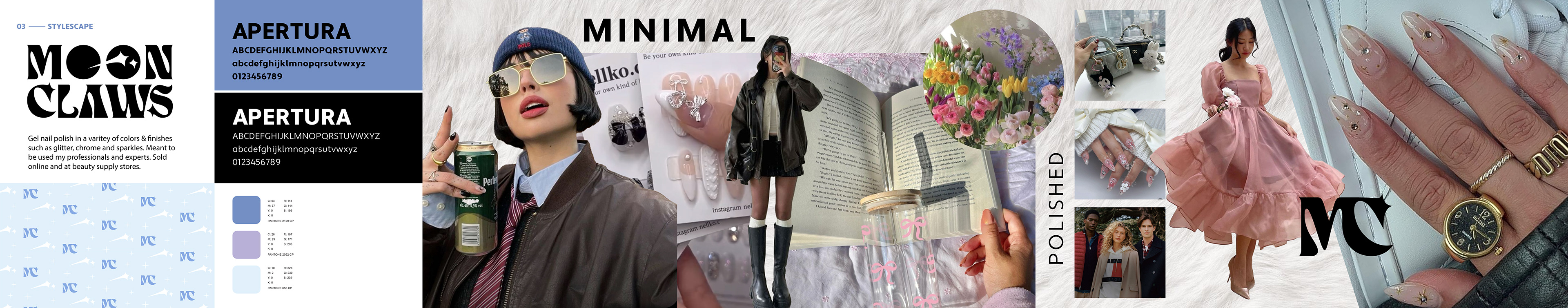
Three different brand themes to resonate with a young diverse audience. Galaxy sparkle, Vibrant and Minimal. Trying to build the brand for the ideal customer for Moon Claws. This helps with our marketing and brand voice.

Created Instagram highlight icons that match the brand concept. Line art style keeping it simple and effective. Using the two main blue colors for good contrast.
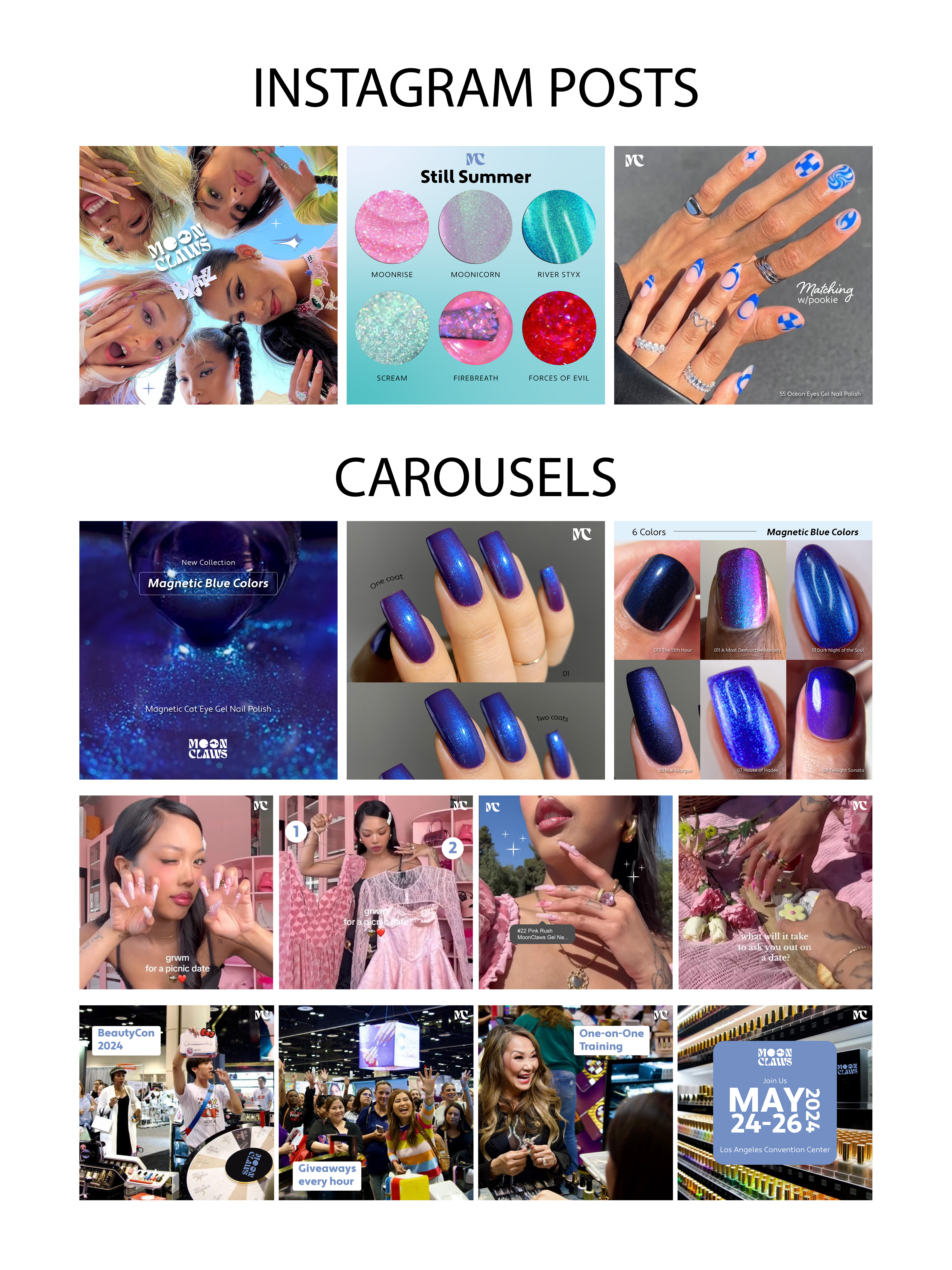
Examples of what our Social Media could look like.